CoPilot
CoPilot helps investment advisors to build and manage client relationships and higher performing investment portfolios
Introduction
Cassia Research’s Flagship product CoPilot helps investment advisors build and manage client relationships and higher performing investment portfolios.
UX Design with Cassia Research
As the UX design lead for Cassia Research, I was responsible for designing the entire user experience for the application. I worked closely with the product team to identify critical touchpoints for users and come up with solutions that improves overall user experience while aligning with the company’s business goals.
Initial Project UX Goals:
- Create an application with powerful tools that will speed up the workflow for advisors
- Reduce information overload and redundancy
- Empower advisors to improve their overall client relationships through quality engagements
Kickoff - Heuristic evaluations
By studying other applications and conducting heuristic evaluations, I gained a more in-depth industry and product knowledge. Furthermore, I was able to identify the strengths and weaknesses of other similar applications and found out the common pain points that users could encountered.
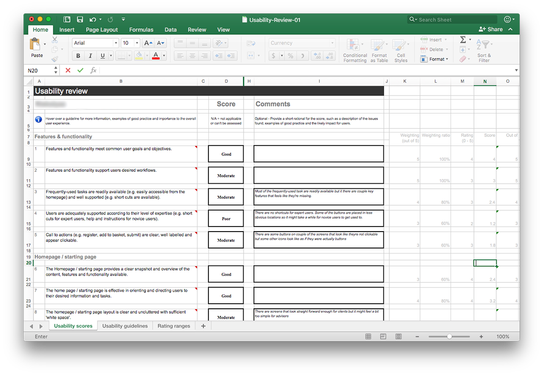
This ultimately helped the product team to identify the crucial UX touchpoints, which allowed us to be a lot more aware when designing upcoming features and pages.
Information Architecture + User Flow
In order to create a powerful tool and improve advisors’ workflows, the product team had worked closely with advisors to improve the existing information architecture of the web application and simplify the overall navigation system.
After documenting the existing information architecture and user flows, I created simple sketches and storyboards so we could initiate conversations and collaborations with the team and stakeholders visually. This also visually allowed the team to further explore some of the challenges that advisors were currently facing and identify if there were any missing customer engagements for all the touchpoints.
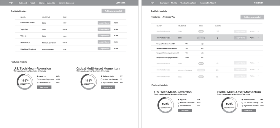
Here are couple of the challenges the advisors were facing:
- Their workflows are complicated
- The work they do often requires numerous steps and multiple software
- They have a lot of work to do and lack the tools to generate more qualified client leads
By using these tools to collaborate with the team and advisors, we also identified the key tasks flows and allowed us to further improve the IA and user flow. Since advisors also have a lot of ideas and insights to improve their workflow, this process was quite effective since we were able to collaborate visually.
We redesigned our user flow and IA to improve their workflow with the following focuses:
- Connecting touchpoints with meaningful engagements that optimizes the advisors workflow
- Reducing information redundancy and simplify pages to display only the necessary information at the right time.
- Improving existing flows to promote and educate new tools for advisors to generate more leads
Wireframes + storyboarding
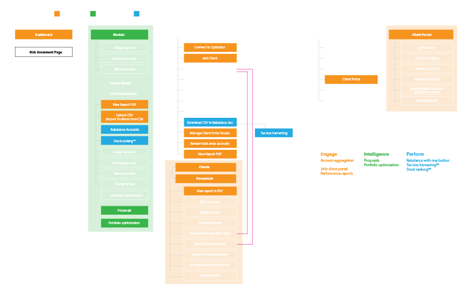
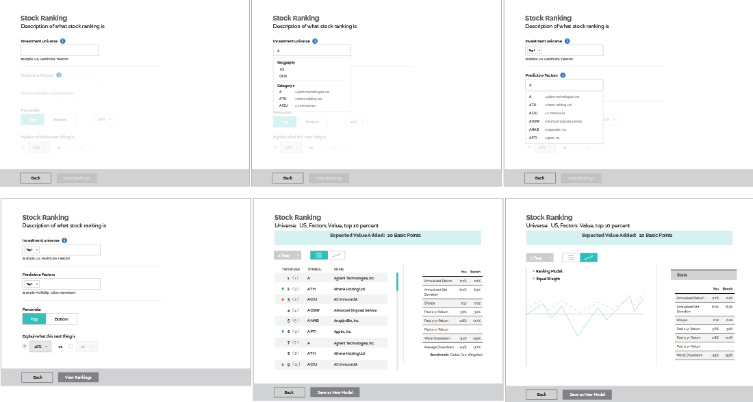
One of the biggest challenges when designing co-pilot was the amount of information and interactions required on the screen. There was a lot of quick wireframes and rapid prototyping, which allowed us to conduct guerrilla user testing so we can quickly iterate and simplify our design.
Mockups + Prototyping
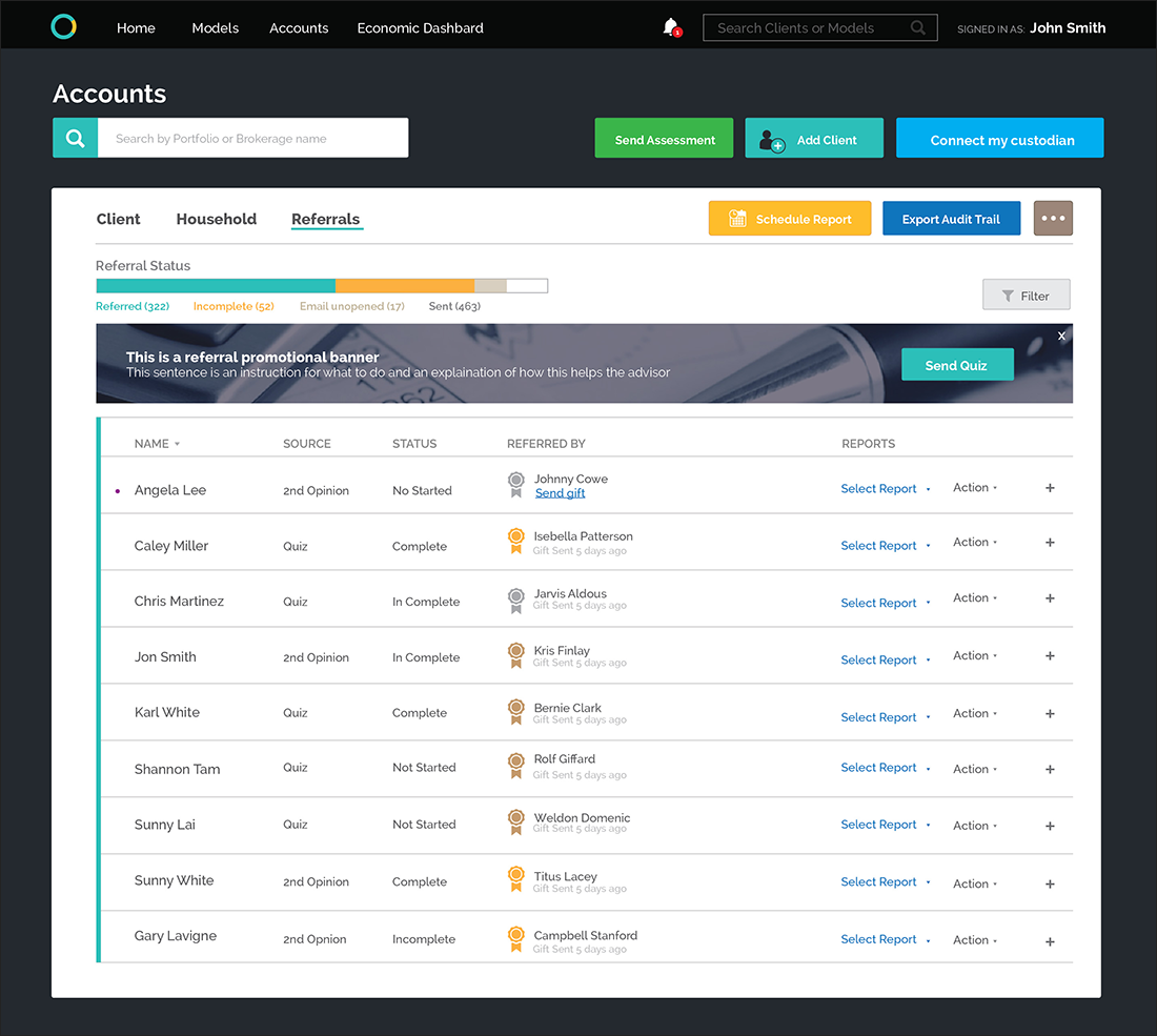
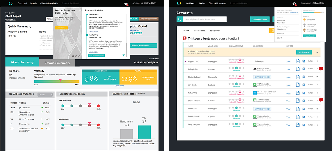
Although the priority of my work was focused on UX, I was also responsible for creating mockups for some of the core screens. We wanted to further improve the screen readability due to the high information density on some of the main screens.
It was very crucial for us to learn from our users and allow them to get a chance preview our application and features before launch. We created many hi-fi prototypes to conduct usability testing and walkthroughs with our stakeholders. This ultimately allowed us to collect a lot of valuable qualitative feedback and got a chance to improve our application as much as possible.
Final Product
Want to learn more?
Please feel free to contact me for further info