The University of British Columbia
Faculty and Staff Website
Provides resources for UBC faculty and staff to learn more about the Enrolment Services and Student Development & Services units
Introduction
This website constrains resources offered by Enrolment Services and Student Development & Services units for UBC faculty and staff.
UX Design with The University of British Columbia
I was the UX designer for the faculty and staff website redesign.
I worked closely with different departments to learn more about their workflow, and identified some of the challenges they have with the current website.
I also collaborated closely with the development team to ensure that the admin authoring tool would be quick and easy to use.
Here are some additional initial goals we have set:
- Create a resource hub that will speed up the workflow for advisors
- Reduce information overload and redundancy
- Create communication hub between students, administration staffs, academic staffs, and media networks.
Project Kickoff
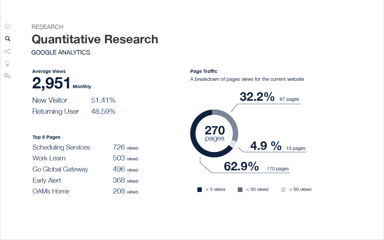
Since the entire website had few thousands of webpages and lot of the content were outdated, I worked closely with the communication coordinators on the team to perform a qualitative analysis by creating a content inventory
User Studies
Although the content audit helped a lot, some of the outdated information might be useful for some stakeholders so we had to find ways to determine the importance of each content.
We created discovery workshops and invited stakeholders from different departments to learn more about their work and identified some of the problems they encountered with their work and the current website.
I created a research plan and workshop scripts to properly facilitate the workshop and made sure the information we collect would be valuable.
Some of the activities we did for the user study phase:
- Card Sorting
- Focus Groups
- Individual User Interviews
- Group Brainstorming Sessions
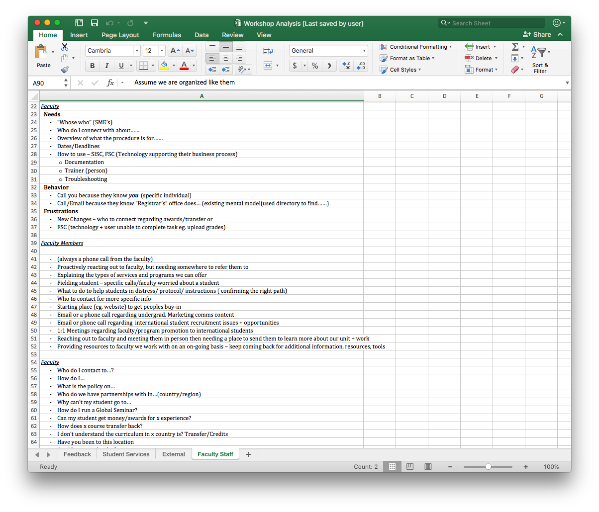
After hosting 8 sessions of workshops and individual interviews, we gathered our findings and evaluate some of the challenges that actually reflect the current website
Based on the findings, the main obstacle was the lack of a communication hub between different departments :
- Different department had different sets of jargons
- Nobody knew who to contact to find the information they need
- Nobody knew where to find the information they need
- Some knowledge was documented in some departments but not communicated to others

Content strategy + IA
It was clear that we had to define our content vision to ensure that the website would
be useful for the intended readers.
Since the content of the website needed to be restructured and a lot of content had
to be rewritten, I collaborated closely with the communications coordinators
to come up with a content strategy and information architecture based
on our findings.

Exploration - Sketches/ wireframes
Aside from focusing on the content strategy with the communication coordinators,
I was also responsible designing the front facing website as well as the admin tools.
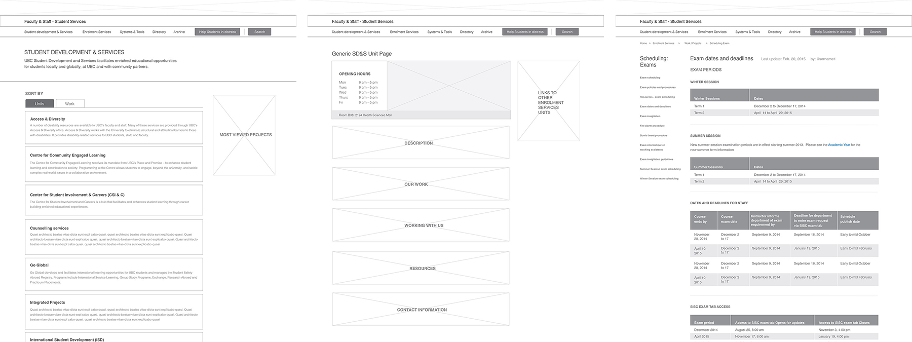
I started off with sketches to initiate collaborations and gather more
information with our stakeholders. Afterwards, I came up with wireframes to do
guerrilla testing with students and colleagues to quickly identify if there was any obvious usability oversight.
Our priorities during this phase were:
- To ensure that the website’s look and feel would be consistent regardless of different authors
- To create a website and an admin system that require minimal resources for content governance
- To redesign a new navigation system that displays the work and purpose for each unit
- To design new tagging system that educates all staff the relationships between each content and its functions
Prototype, User Test, Iterate
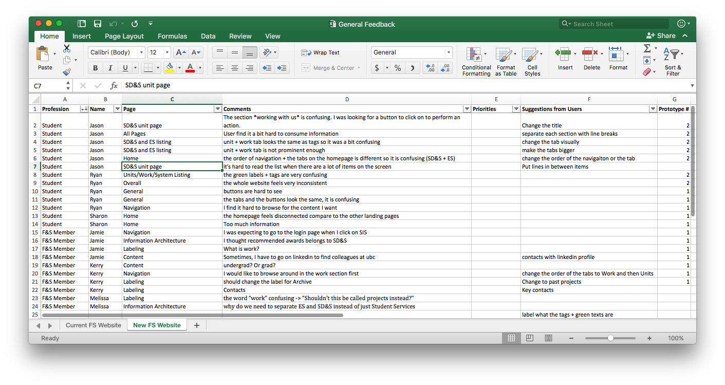
I created lo-fi and hi-fi prototypes, conducted usability tests, and iterated based on the findings.
Design Guide + Dev Spec
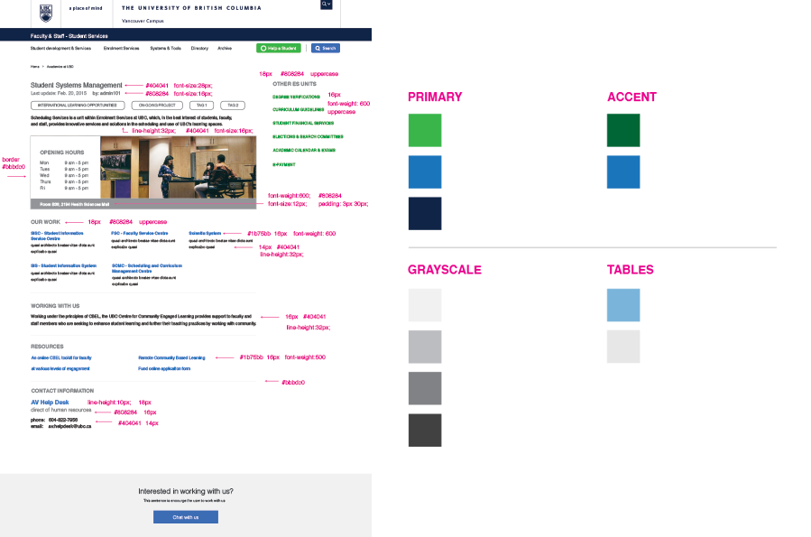
After multiple iterations of prototyping and user testing, the design of the website and authoring system was close to complete. I created a style guide and collaborated with the development team to create development specs to speed up the development process.
Authoring Guide and Tutorial
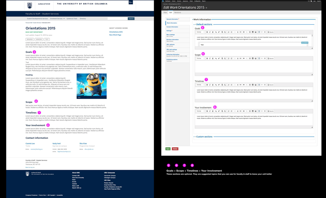
In order to create a better on board experience for the authors across different departments, I created authoring guides and step by step tutorials to educate the authors in creating and uploading content.
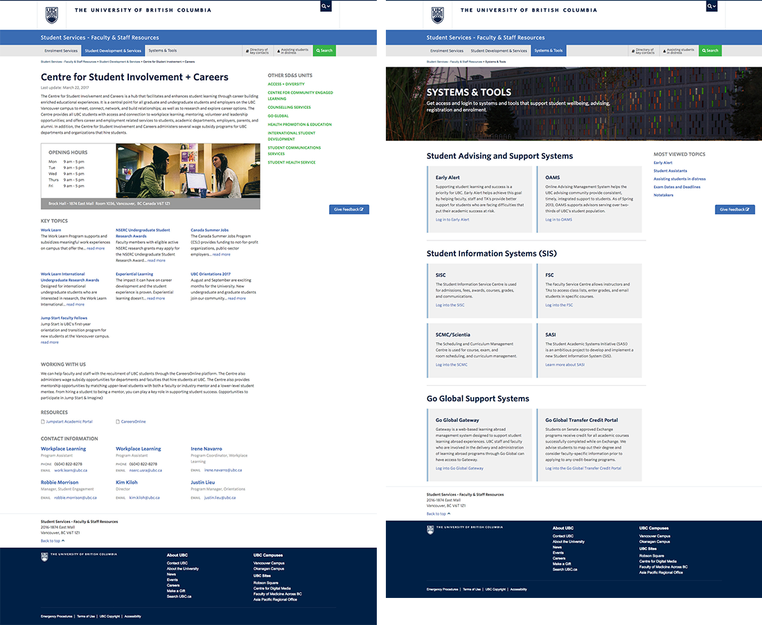
Final
Want to learn more?
Please feel free to contact me for further info